Data visualization is a powerful technique for understanding and communicating complex data effectively. Python offers a rich ecosystem of data visualization libraries, each with its unique set of features and capabilities. In this article, we will explore some of Python's most popular visualization libraries and demonstrate their usage with practical examples. So, let's dive in and discover Python's wonderful world of data visualization!
Matplotlib:
Matplotlib is a widely-used plotting library in Python that provides a flexible and comprehensive set of tools for creating static, animated, and interactive visualizations. It offers a pyplot interface for creating plots, charts, histograms, scatter plots, and more.
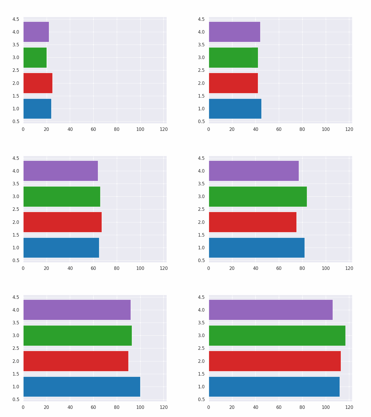
This is an example of a bar plot that changes over time, created with Matplotlib.
import matplotlib.pyplot as plt
import matplotlib.animation as animation
import numpy as np

fig, ax = plt.subplots()
rng = np.random.default_rng(19680801)
data = np.array([20, 20, 20, 20])
x = np.array([1, 2, 3, 4])

artists = []
colors = ['tab:blue', 'tab:red', 'tab:green', 'tab:purple']
for i in range(20):
    data += rng.integers(low=0, high=10, size=data.shape)
    container = ax.barh(x, data, color=colors)
    artists.append(container)


ani = animation.ArtistAnimation(fig=fig, artists=artists, interval=400)
ani.save(filename="pillow_example.gif", writer="pillow")

Plotly:
Plotly is a versatile and interactive visualization library in Python. It offers a wide range of chart types and interactive features, making it suitable for creating interactive dashboards, visualizations for web applications, and exploratory data analysis. Plotly allows you to create visually stunning and interactive plots with just a few lines of code.
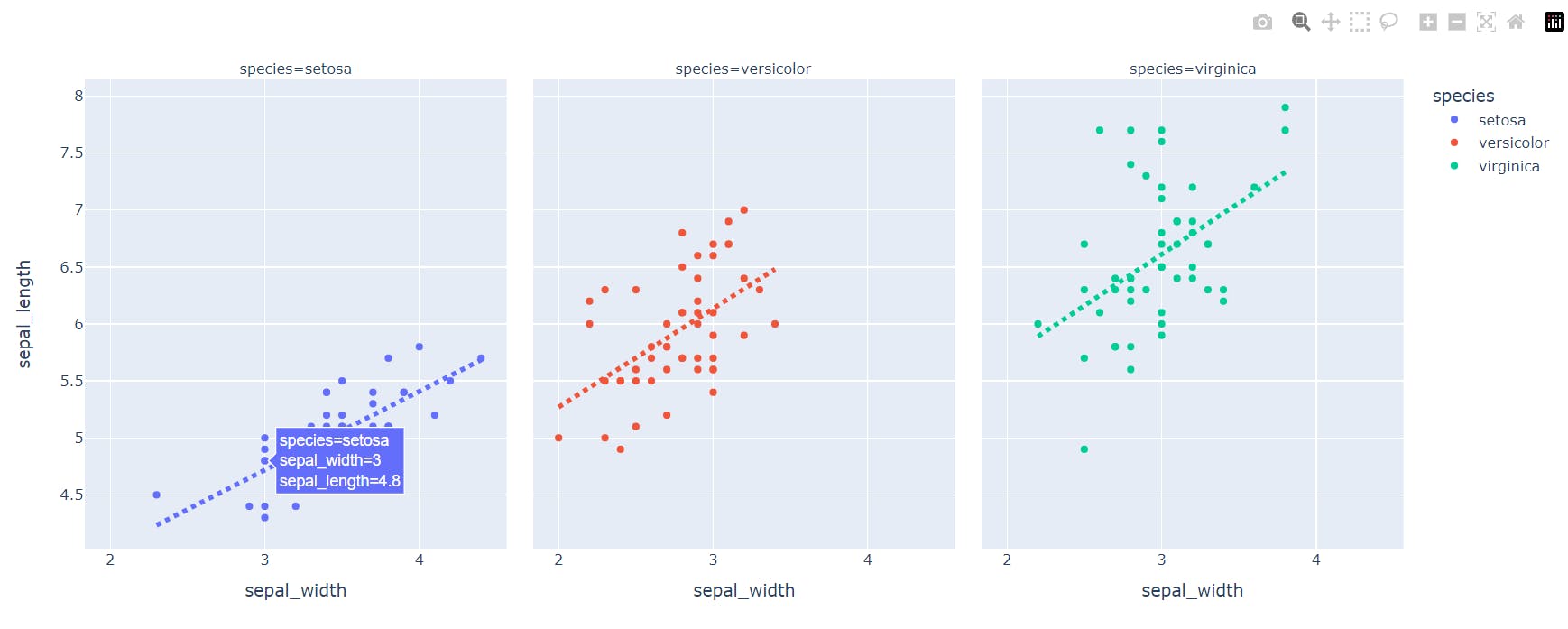
Here is an example of an interactive plot of sepal length and width data from the Iris dataset, created with Plotly.
import pandas as pd
import plotly.express as px

df = px.data.iris()

fig = px.scatter(df, x="sepal_width", y="sepal_length", color="species",
                 facet_col="species", trendline="ols", title="")

fig.update_traces(
    line=dict(dash="dot", width=4),
    selector=dict(type="scatter", mode="lines"))

fig.show()

Seaborn:
Seaborn is a high-level visualization library built on top of Matplotlib. It provides an intuitive interface for creating attractive and informative statistical graphics. Seaborn simplifies complex visualizations and offers functionalities for handling categorical data, creating regression plots, and visualizing distributions.
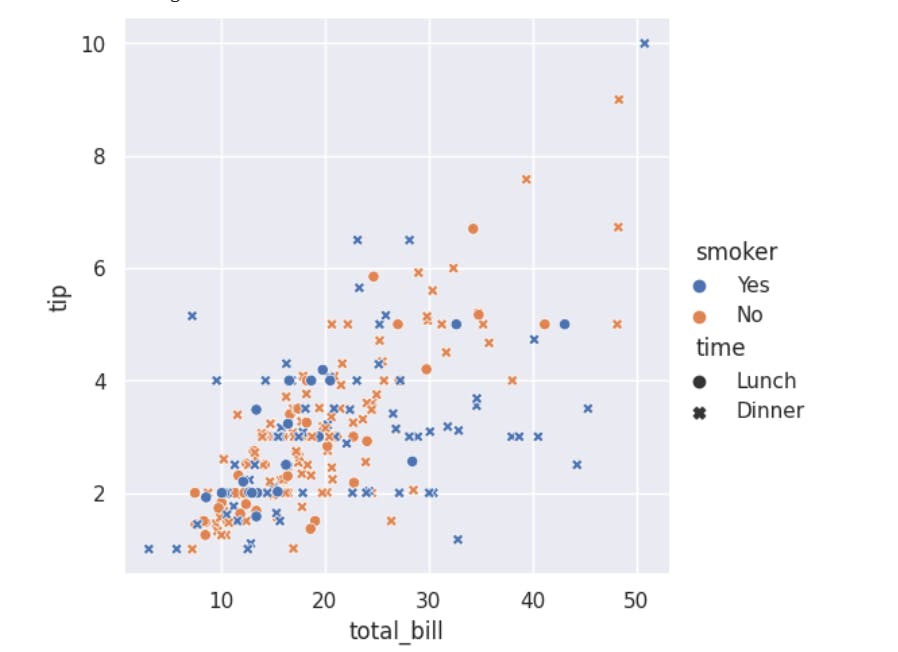
Here is a sample restaurant dataset that shows how bill amounts and tips vary by time of day.
import seaborn as sns
sns.set_theme(style="darkgrid")
tips = sns.load_dataset("tips")
sns.relplot(
    data=tips,
    x="total_bill", y="tip", hue="smoker", style="time",
)

Bokeh:
Bokeh (Advanced) is a powerful library for creating interactive visualizations in Python. It emphasizes interactivity, allowing users to explore and interact with data plots through various tools and widgets. Bokeh supports a wide range of plot types, from simple line and scatter plots to complex visualizations like network graphs and geographical maps.
Visualize Streaming Data:

Conclusion
Python has a variety of visualization libraries to suit different needs. Matplotlib, Seaborn, Plotly, and Bokeh are some of the most popular. These libraries can be used to create static, interactive, or specialized statistical graphics. Experiment with these libraries to uncover patterns, communicate findings, and gain insights from your data.
Visualization is not just about aesthetics, it is a powerful tool for understanding data. So, start visualizing and let your data tell its story!